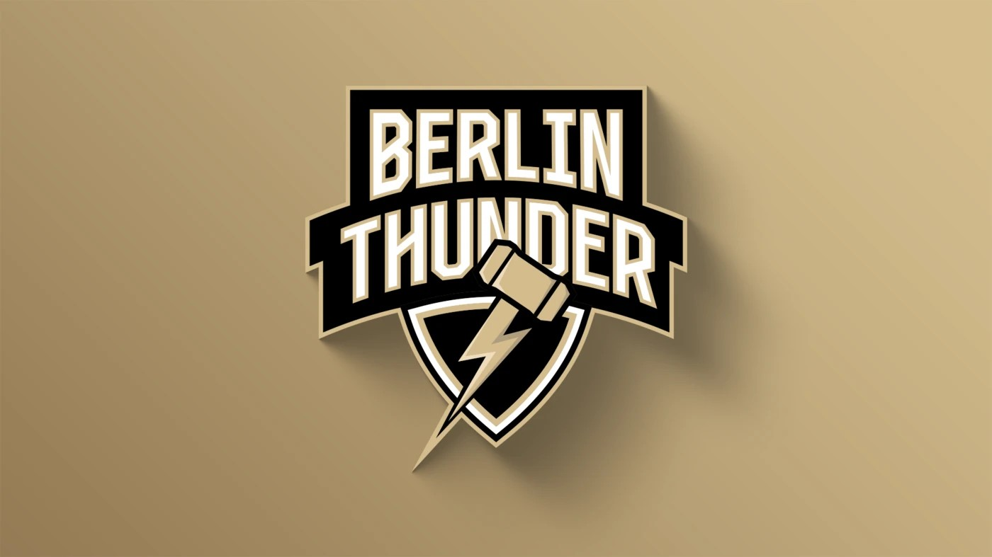
The Berlin Thunder have revamped their logo announcing it as “a new bold look – strong, modern and deeply connected to the capital”.
In a statement, the Thunder traced the origins of the logo back to Norse mythology and explained the color scheme:
“This comprehensive rebranding introduces an iconic new logo that unites Thor’s hammer and lightning – a tribute to Norse mythology and our own history. These powerful symbols represent the strength, determination, and unmatched fighting spirit that define the team in the heart of Berlin. Berlin Thunder embodies the dynamic energy of a city that never sleeps and is always full of life.
“The new color scheme – black, white, and gold – reflects the strength and elegance that Thunder Nation exudes, embracing the Berlin community. Black stands for power and determination, white symbolizes potential and clarity for each new season, and gold adds a distinctive touch of excellence and pride. These colors fuse Berlin Thunder’s traditions with its vision for the future, resonating throughout the fan community and beyond.”
With this, two teams have now changed their logos this off season. Last week, the Feheverhar Enthroners announced that they had redesigned their logo. During the 2024 season, the Vienna Vikings announced that they were bringing in a new logo.

